Designed and implemented a full design system with 40+ Figma components

Ceramic is a design system I designed and created that is used by Bord and Vizible, two apps that I was the lead designer for. It is a robust design system with over 40+ configurable Figma components, styles, guidelines, and more. The design system also includes typography, color, spacing, depth, guidelines for usage, automatic dark/light modes, and more. Role: I was the only designer -- worked with devs and the startup founder Industries: Remote working tools, whiteboarding, collaboration Tools used: Figma, Notion, Slack, Zoom, User Testing, Bord, Storyboard Duration: 1 month to complete full Figma design system, 3+ months to code

Understanding the Problem

Most important first step I always take is to step back and evaluate the problem being solved. I make sure that we are trying to solve the right problem and gather any information that will help frame the problem and come up with ideal solutions.
Competitive Analysis
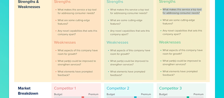
First step was to look around at competitors as well as highly regarded design systems. I created various whiteboards and Figma pages compiling the best ideas and concepts from all of these different design systems. I then worked with the startup found and developers to understand the development perspective and ensure that any design system I design will be robust and easy to code and maintain.
Decided what was needed
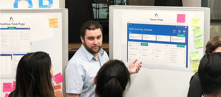
The next step was to determine what components and variables would be needed for both the Bord and Vizible apps. I made a list of components and workshopped with the others on the team to narrow it down to a High, Medium, and Low priority for each component. We were also able to determine development difficulty per component.

Ideation and Research

With a firm foundation from the competitive analysis, user interviews, and requirements, it was time to get started on the design work so that we could determine what the MVP will look like.
Layout and Templatization
To ensure that the design system is consistent and easy to work with, I designed a series of templates and components. These included common language, scalable variables, header layouts per component and more. The goal was to account for any need a component may have in the future and to ensure that the Figma design system could also serve as a useful library of the components until a more permanent webpage could be made in the future.

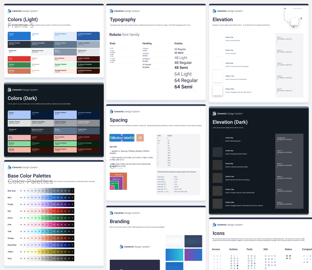
I then created all of the color, typography, elevation, spacing, and other variables to ensure that the components I would be designing would be consistent and based on a foundational set of variables that could be changed later without the need to adjust individual components.

Lastly, I designed a common style and set of guidelines for icons, then made 50 or so of the most needed icons.
Component Research
Starting with the components that were deemed a High priority, one component at a time I researched that individual component across top apps and competitor apps to ensure that the component I design would be robust enough to meet various needs, look stunning, and also appear in a way that the user expects for intuitive usage.
Component Design
With all the prep work done, I rapidly went one component at a time and designed all of the variants and variables needed. This included headers, titles, error states, validation conditions, dark/light mode, and more.

I then tested each component to ensure that there were no bugs that could be found.

Lastly, when a component was done, I implemented the component adding it to the app designs for Bord and Vizible to ensure that the components had all the variants and configurations needed.

The Solution

With greater confidence from the ideation and research phase, we moved to final MVP designs and coding. That was then followed by user testing with the live coded version.
1. Color, Font, Spacing, and more
  • Color
    I decided on an adaptable two level color system since it can be changed later more easily and allows for different apps to have different color schemes. This involved a 0 to 100 light to dark scale per color as the first layer, then from this scale the actual variables used in the apps would be abstracted. For instance, the color Blue 70 is used for the variable “Primary” which is then used for the color of primary buttons.

  • Typography
    I went with Roboto for the font family since it is an adaptable Sans-Serif font with widespread usage and many weighting options. For the typography scale, I ensured that the minimum size met accessibility requirements and then provided font-sizes at necessary increments, 13px, 14px, 16px, 20px, 24px, ... and so on.

  • Spacing
    To keep the spacing consistent, I went with an 8px grid. An 8px grid ensures that objects from component to component and page to page feel consistent.

  • Elevation
    As apps become more complex, there’s a greater need to differentiate between various components and design elements. I settled on a simple set of elevations to ensure consistency across various elevations from low level elevated elements like tooltips and dropdowns up to higher level elevated elements like popovers and modals.

  • Iconography
    Due to the 8px grid, I went with 24px by 24px boundary for icons with a 16px by 16px target size. This ensures that all icons are weighted properly and feel the same size. For instance, a 16px square will appear larger than a 16px circle, so the circle needs to be 18px to feel the same size as a 16px square. The 24px boundary allows for this kind of flexibility and ensures that all icons feel the same relative size even if they are tall and skinny or wide and short.
2. Buttons and Links
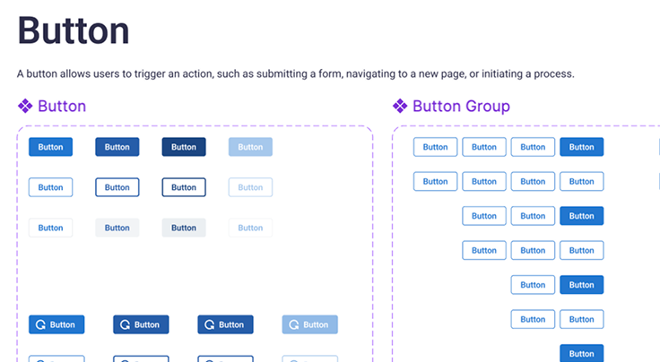
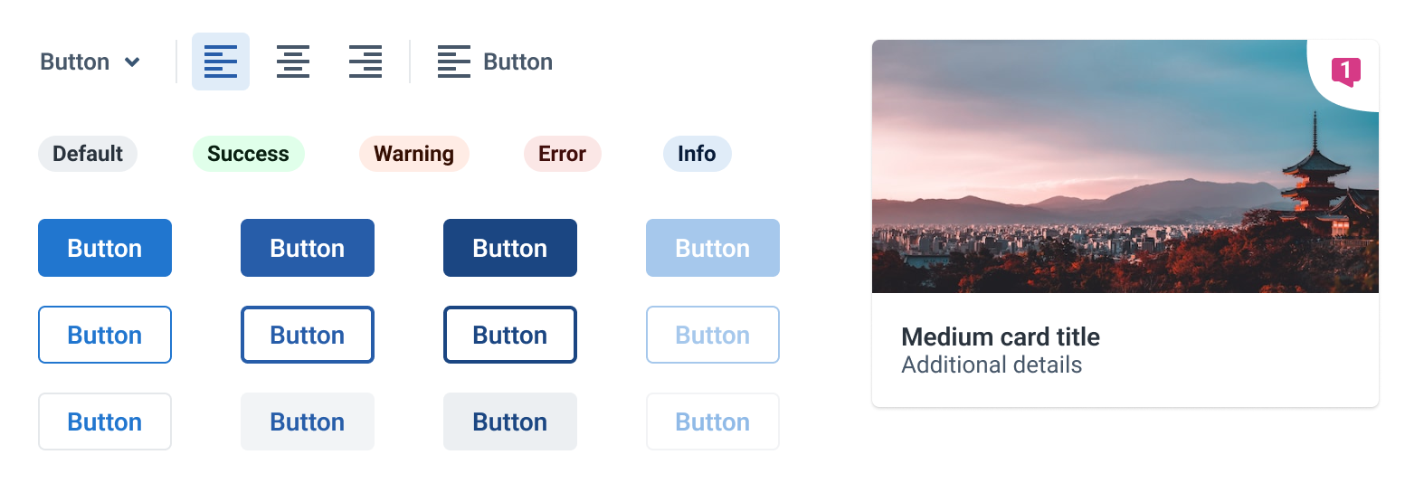
There’s a great deal of button-like components, so it was important to keep it to the minimum required while at the same time ensuring that the design system is able to scale as needs are introduced in the future. Some of the button components I designed were:

Standard Buttons that include primary, secondary, and tertiary states.

Toolbar Buttons that serve as smaller buttons that are typically found in toolbars.

Badge Buttons that serve as state indicators and information that can optionally be clickable.
3. Form elements
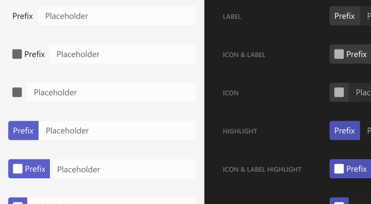
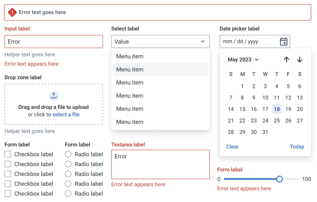
One of the cornerstones of a well though out design system is a comprehensive set of form components with all of the states and conditions covered. I designed a complete set of form components and included error states, helper text, grouped states, and more. Every component has a hover, focus, active, error, default, and other necessary states.
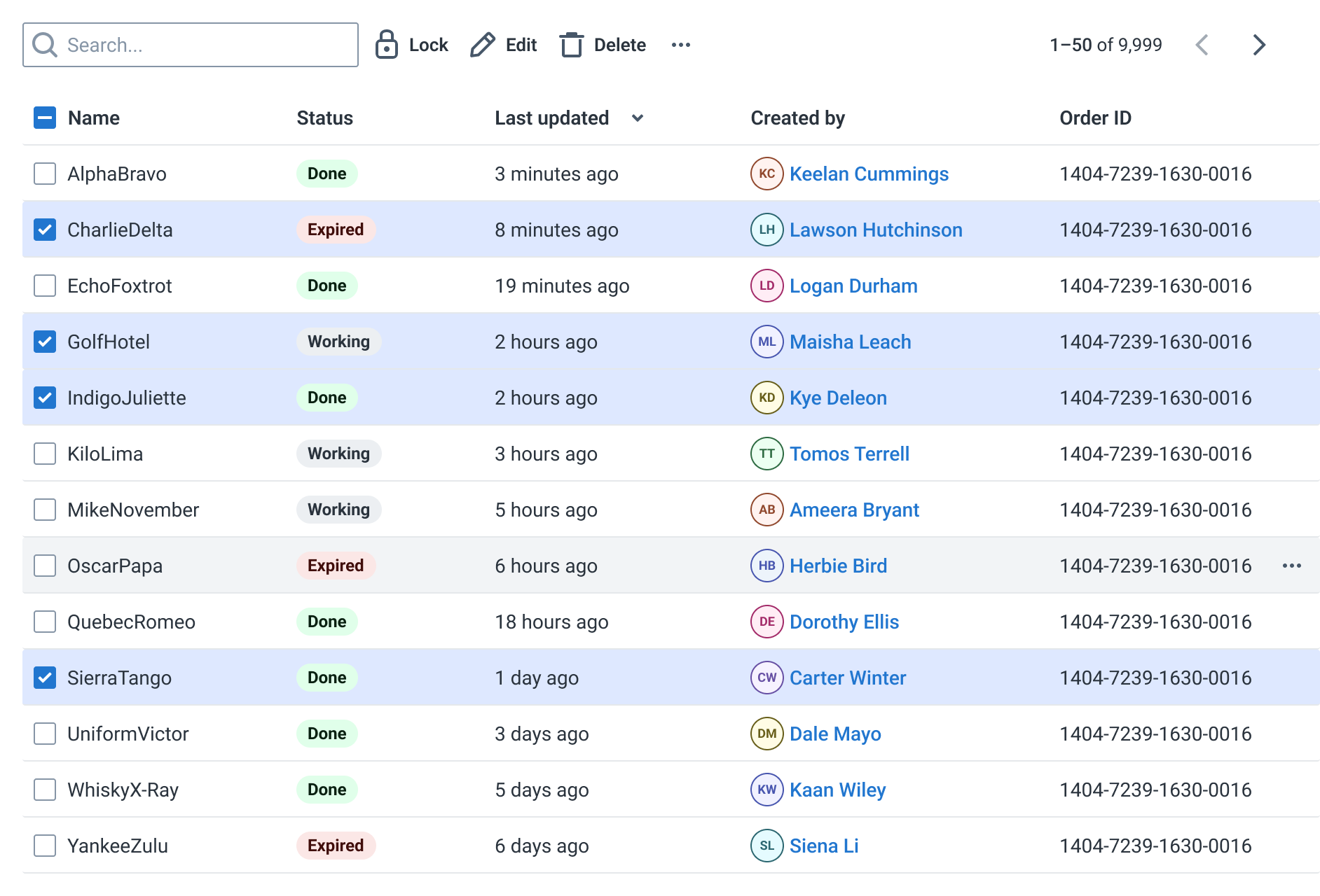
4. Tables
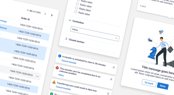
Tables tend to be one of the most complicated patterns in a design system, so when it came time to design the table format for Ceramic, I treated in many ways like an app unto itself. Thorough research and my own experiences led me to a pattern that includes a customizable toolbar at the top followed by an adaptable set of columns and rows. The pattern accounts for optional multi-select (including a multi-select toolbar at the top) and pagination to ensure that this pattern can handle a large amount of data if necessary.
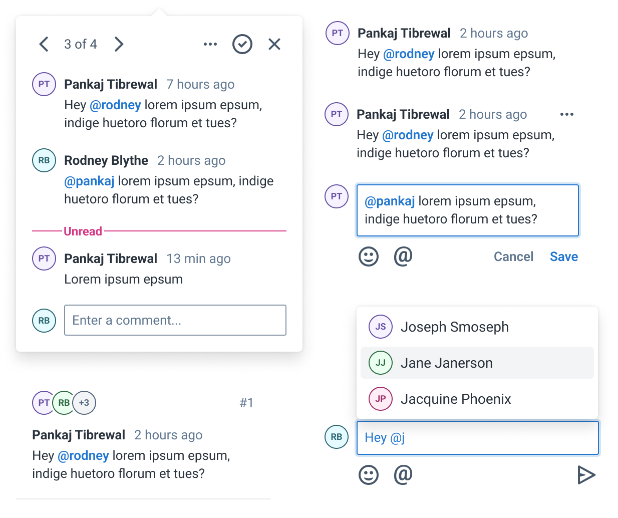
5. Commenting
Not every design system requires commenting components, however, the apps Ceramic is tasked with supporting have a large focus on collaboration. I did a great deal of research on existing commenting patterns and pulled from my own experience before settling on an approach to the commenting components and patterns. This includes a contextual popover style for viewing individual comment threads as well as a side-panel for viewing a list of comment threads.
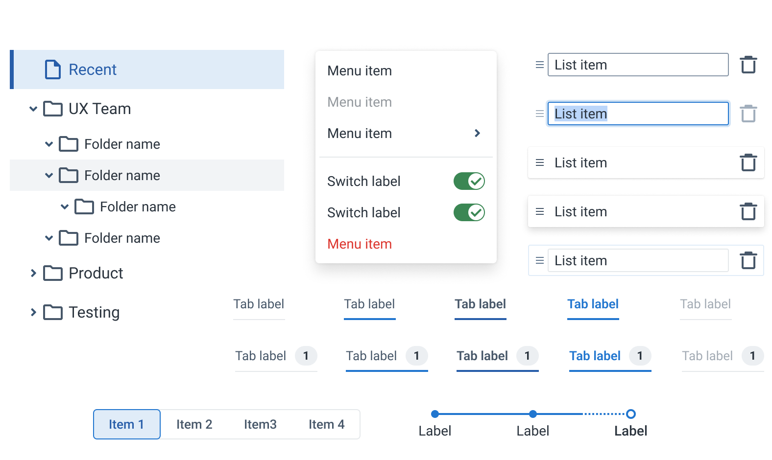
6. Tabs, Menus, and Lists
An important part of any design system is navigation. I ensured that navigational components were well thought out, consistent, and easy-to-use. This included vertical list navigation components, tree views, horizontal tabs, segmented display tabs, and wizard step navigation.
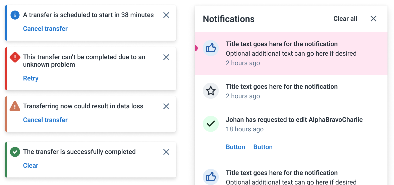
7. Messaging and Notifications
Since the apps that the Ceramic Design System supports involve a lot of collaboration, it was important that the design system include components for handling notifications and messaging. I designed a robust notification panel that can distinguish between read and unread as well as new and old. Additionally, I designed a toast messaging component that can overlay overtop of the screen temporarily interrupting the user when their attention is needed.
And many more components, to see the rest view the figma file