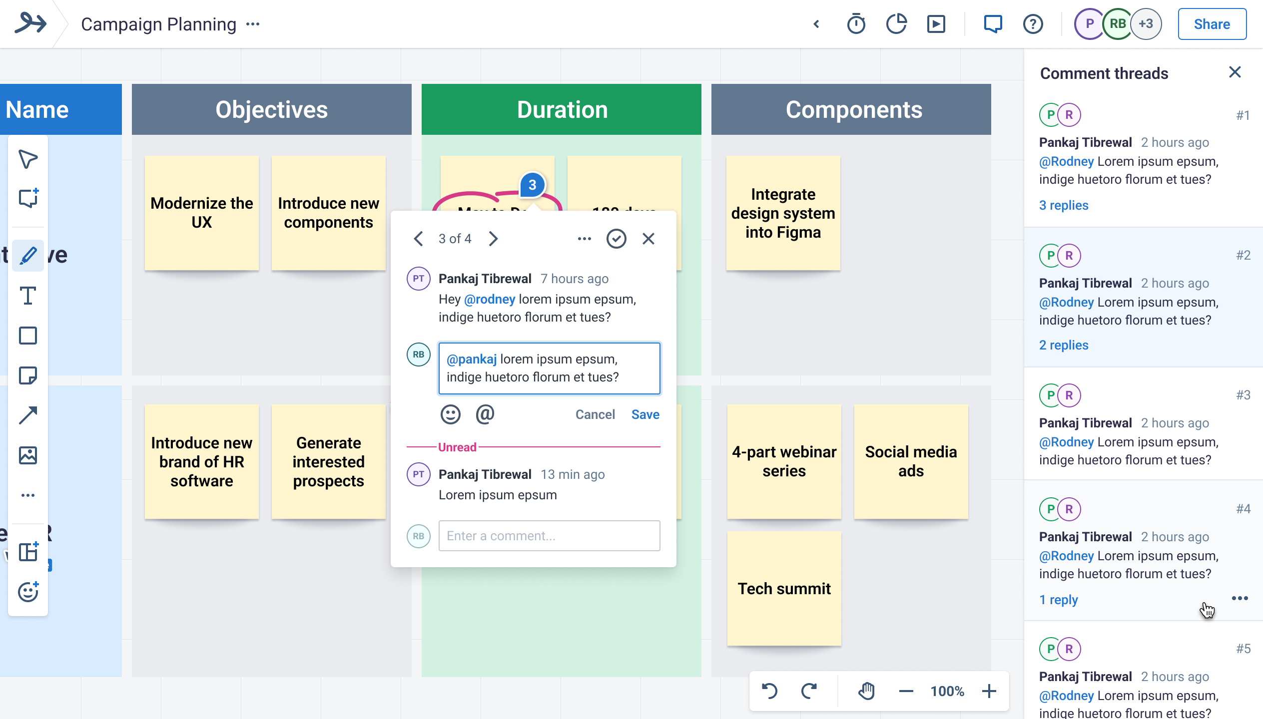
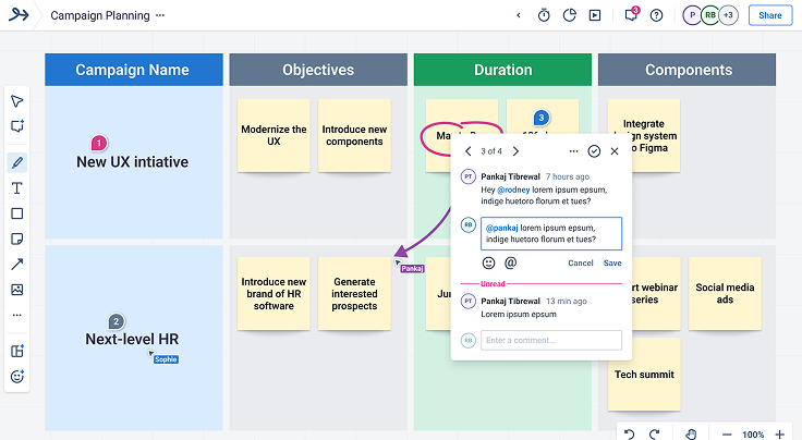
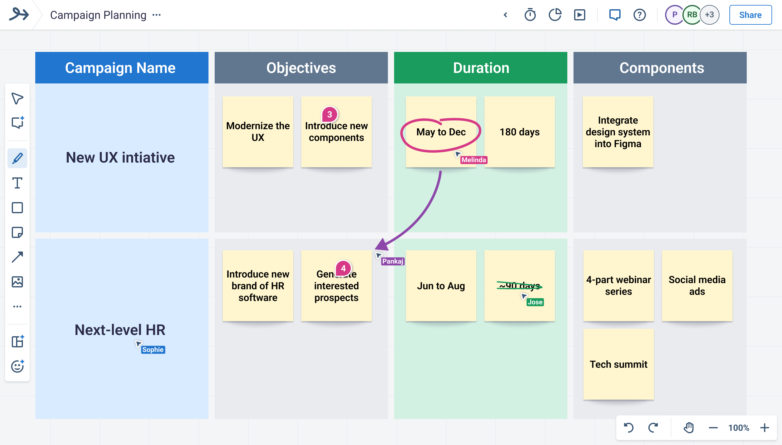
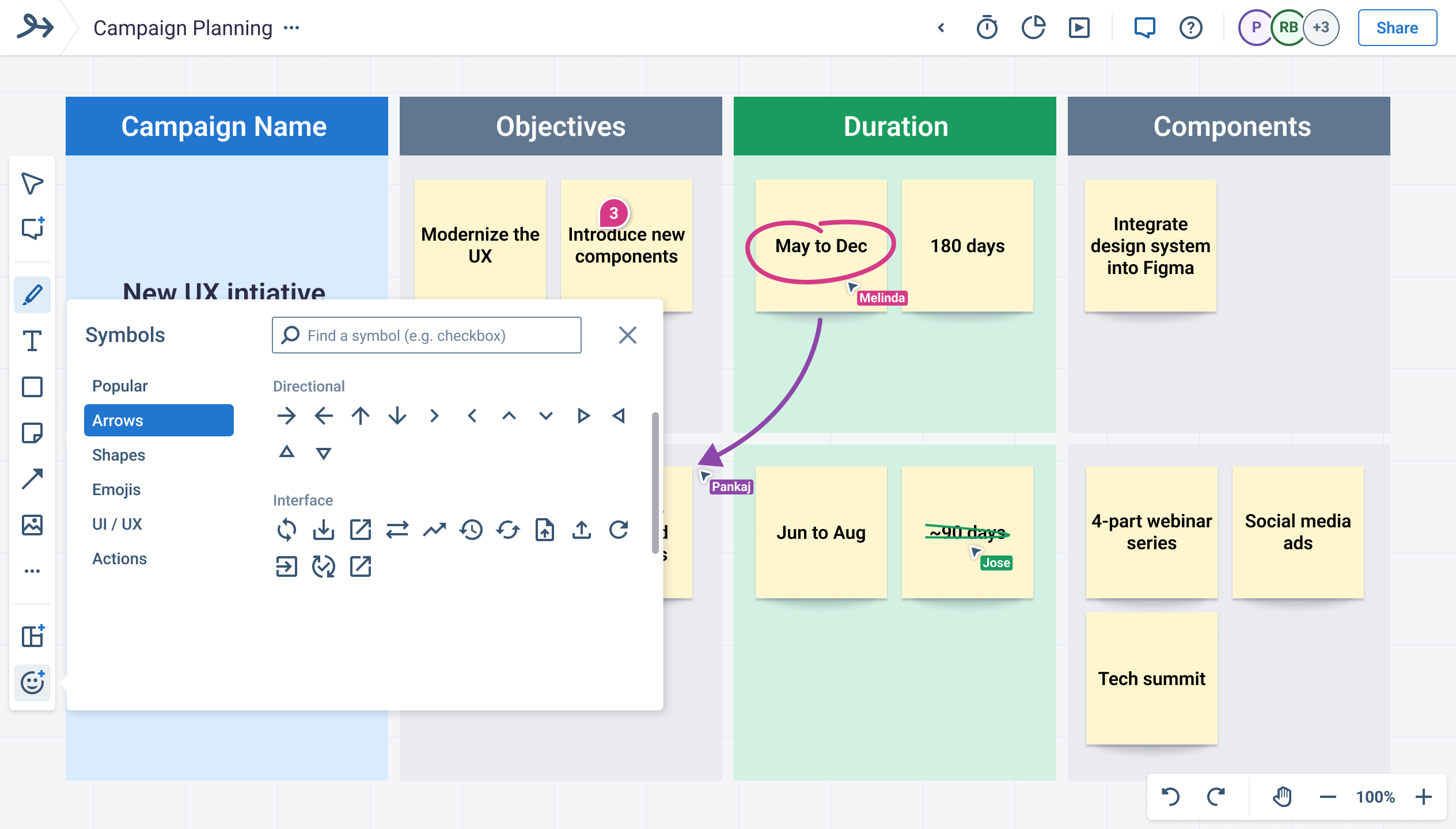
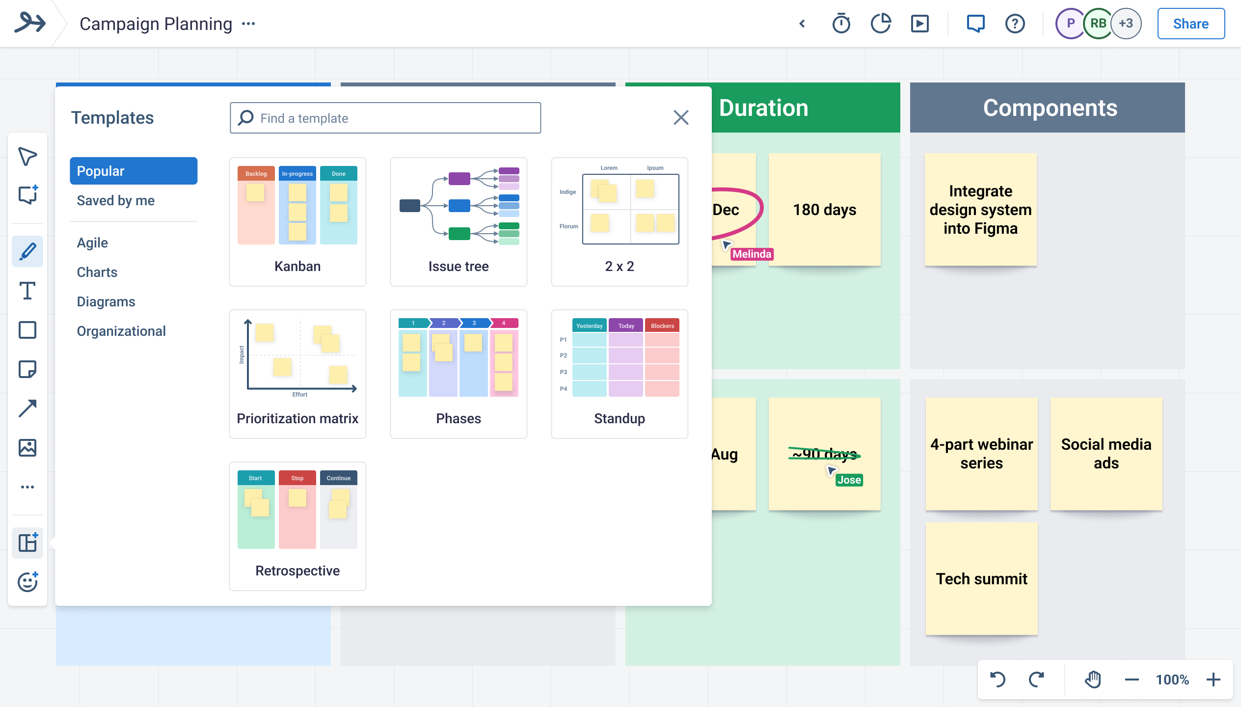
Bord is a whiteboarding app that seeks to provide a simple and intuitive experience that users understand immediately. A key feature of the app is its ability to creates symbols and templates that make whiteboarding simple and easy, even for users that say they can’t draw.
Role: Lead UX Designer -- worked with devs and the startup founder
Industries: Remote working tools, whiteboarding, collaboration
Tools used: Figma, Notion, Slack, Zoom, User Testing, Bord, Storyboard
Duration: Initial MVP took 3 months, I continued as lead for 2 years
Competitive Analysis
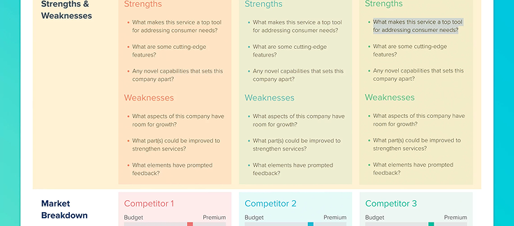
The startup founder and I thoroughly researched and evaluated existing whiteboarding and collaboration tools. We compiled Notion pages summarizing our findings. We then whiteboarded remotely to consolidate our analysis into more concrete findings. From these findings we identified what problems our whiteboarding app would need to solve, potential stand-out features our app could have, and the business objectives.
Experimentation and Research
We then set out to rapidly storyboard and whiteboard different ideas for key differentiators that would separate our whiteboard app from competitors. We mapped out the journey the users would take in these various ideas as well as designed lo-fi concepts of how it could look.
User interviews were the next step, doing both quantitative anonymous surveys and testing as well as qualitative one-on-one interviews to get a better idea of what features our whiteboarding app should include.
Requirements and JIRA
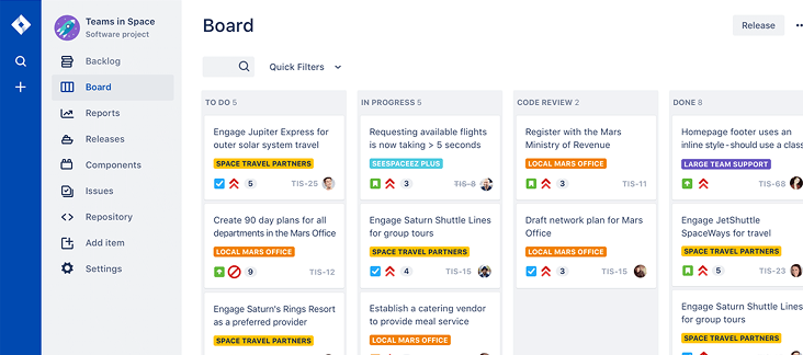
Now that we had identified the features that the whiteboarding app would have, the startup founder and myself wrote out the requirements in JIRA with associated documentation in Notion. We then worked with the development team to prioritize the features based on dev difficulty so that we could determine what would be coded at each milestone working towards the completed MVP.
User Journey
When starting a new project from scratch, I find its always a good idea to determine what user personas or at least what kind of users will use this new feature and to map out their possible journeys through the UX for the project. Since this was a brand new company we developed a set of assumed user personas that we would modify and expand upon later.
I then proceeded to create journey maps and user flows for all of the MVP scenarios. This helped to identify any shortfalls, missing requirements, or potential issues, before I started mockups and design work.
Rapid Mockup Iteration
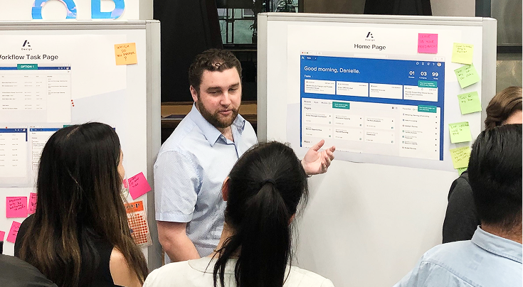
It was then time to move on to the solutioning phase. For each MVP feature, I started out by sketching out some ideas and then whiteboarding with the team to discuss my proposed solutions. Once we narrowed in on a few good options, I then rapidly produced higher quality prototypes that we could test with users to determine which of the UX solutions is the best and to refine the solutions based on their experiences and feedback using the prototypes.
User Research
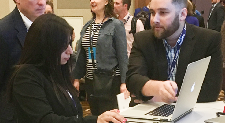
We performed a mix of qualitative and quantitative research. UserTesting.com served as our main source fo of quantitative research as well as some simplistic asynchronous prototype testing. For more intensive qualitative research we used zoom for one-on-one interviews with potential customers, allowing them to try out prototypes and view potential concepts to get their feedback. This combination of research methodologies allowed us to have greater confidence that our MVP was ready to be coded.


